Monday, October 20, 2008

Spidey 3

Here are a few keyframes I did for Spidey 3 a few years back. I joined the embattled project pretty late in the game, right after the production design regime change from Neil Spisak to Mike Riva a few weeks into principle photography. We were only a few weeks out from shooting the final battle scene and they had already started building a full-sized set of the first few stories of a skyscraper under construction. Unfortunately the actual scene to take place in the set hadn't been written yet.

I was brought in initially to visualize some of the action and also to design how the same set could be dressed to represent several different levels of the building under construction.

I've never been on a movie where the script changed so radically so often. I wouldn't be half-way through a keyframe when someone would look over my shoulder and say "Oh. Didn't you know? It's no longer Venom in that scene, it's Goblin..." This is why we paint in layers...
It was also pretty political with the change-over in art department. Jim Carson and I kept getting asked to do pretty much the same work, which was really demoralizing, particularly for him since he'd been on the project for over a year already doing great work. I felt really bad, it just wasn't a fun environment. The construction site set ended up being struck and rebuilt twice more for re-shoots. Ahh, this is how movies are made these days. And we wonder why they're so expensive... Anyway, on to the art...


The construction site, ground level. The illustration was painted over a photo of a foamcore & plastic maquette by Brent Phillips of the basic structure. I had to make this in an infuriating number of layers so that elements could be removed and added to dress the other levels. The other versions are even more boring than this though, as they consist of even more removed.


The big battle with Sandman. This version is based on the character design by EJ Krisor, but really doesn't do his awesome version justice. This shot owes a lot to Jim Carson's previous version which you can see on his site HERE.


Spidey swinging to the rescue, back when it was Gwen Stacey in her sports car, not MJ in a taxi.


And speak of the devil...


I can't even remember which way this went in the final film. I think it was venom coming out of the shadows and not goblin, but I can't be sure, since I painted it both ways.


This ended up pretty verbatim in the movie, which I was pleased about. Really saccharine colors, but fun to paint, since it was all freehand and not bogged down in a thousand layers of photo-manipulation!

Thursday, October 2, 2008

Tripwire Magazine interview

I was recently interviewed for the 2008 Tripwire Annual, a yearly compendium of genre articles and news out of the UK. Worth picking up if you're on the other side of the pond. It's one of those rare articles where they don't try to tell their own story by paraphrasing you beyond recognition, so kudos to Joel Meddows & his crew.

Also features a gorgeous 2-page Dr. Who spread by my buddy Jeff Carlysle & some really sweet storyboards by an english board artist named Martin Asbury who I'm ashamed to admit I'd never heard of.

So pick it up and support good entertainment journalism!

Friday, September 26, 2008

Oh, the Iron Man stuff keeps coming...

I was planning on holding this stuff back until the "Art of Iron Man" book came out (come on, you want there to be some surprises!) but it looks like thanks to the internet once again the cat's out of the bag. A bunch of stuff got posted to Yahoo Movies, including these three images I did at the very end of production as alternate suit designs that would have been in a "Hall of Armor" coda at the end of the film.


This first one is a concept for War Machine. I spent a lot of time on developing this suit, which was of course cut from the script about half way through pre-production. Originally it was going to be called the MK IV armor and would have been weaponized swap-out parts that would be worn over the original MK III armor. Earlier versions were red and gold, and would have been worn by Tony Stark in the final battle sequence.

And for those of you speculating, sorry folks, as far as I know, if there is a War Machine in IM 2, it's unlikely to be this one. You'll just have to wait and see!


This next one is an attempt at suggesting "stealth" technology in the surface treatment of the suit. This was an idea that was played with early on in the MK 3 development, but was ultimately abandoned as not being classic enough. I revived and updated it for this special purpose suit.


This last one has a funny history. Throughout pre-production, every time we would present our designs for the suit, Avi Arad, the film's producer, would ask us for an underwater suit. Now I should mention that there was never an underwater scene in the script, but as the toy licencing is such a large part of the revenue from these films, there was a lot of pressure to use as many variations on the suit as possible in the film, all budgetary condsiderations notwithstanding. Needless to say, the underwater suit never saw the light of day, but in homage to Avi, I drew this one up as a possible addition to the hall of armor.

Tuesday, August 19, 2008

Reset Generation Launched...

Ugh! Sorry it's been so long since the last post, I've just been slammed with work and daddyhood, and I'm a terrible multi-tasker!

A cel phone game I contributed a character to just launched for the Nokia NGAGE platform. Free to play online, so check it out at www.resetgeneration.com. They've been trying to market us as "celebrity designers" (yeah right!!!) so have a laugh at my profile here.

I designed the Monster Trainer character (supposed to be a riff on Pokemon.) Kind of a departure for me, they don't usually let me out of my tech cage to do cartoony work, so it was pretty fun to stretch those muscles. I'm pretty pleased with how it turned out, they stayed pretty faithful to the design.

Below is the original design, along with a couple of development sketches.


Wednesday, June 25, 2008

Iron Man suit early development

The suit design process involved a lot of ideation before settling down and refining the final Mk3 design. Below are some of the sketches from that exploration. This was kind of a shotgun approach, trying out a lot of different aesthetics and rendering techniques.


This first one was an attempt to try to update the color breakup of the original red and gold suit. This one is a lot more of a bruiser than the final production model, and I was exploring some form ideas to try to give the impression of solidity to the sheet metal, shearing off organic forms to create flat surfaces defined by strong edges. This was an approach that we ended up adapting to the final design in areas like the forearms & legs.


The next one came from the concept of "wearable ordinance" as an alternative to the more streamlined "wearable aircraft" approach that had emerged from Adi's original sketch. I referenced modern tank ablative armor, as well as medieval and roman armor. It had an interesting aesthetic, but ultimately wasn't iconic enough.


This was an attempt at a more modular and organic approach, that would have used Electroactive Polymer Actuators (real-life artificial muscles that are being developed by JPL and NASA, using plastics that contract or expand when current is run through them.) Jon noted that the audience expectation would be more mechanical, with miniaturized pistons, actuators & servos to connect with the metaphor of Iron Man. I think he went in the right direction.


A more streamlined and athletic approach that tried for thicker overlaps between plates. Jon felt that this was too much of a "swimmer's body", rather than the more powerful boxer's build he was looking for. As I think we all expected from the beginning, an evolution of Adi's wearable airplane design was ultimately the way to go.

I also spent a lot of time in this phase working on a Mk 4 suit which would be a militarized version (can you say War Machine, anyone?) that was ultimately cut from the script. With any luck it will turn up in the sequel!

John Berkey

It seems to be a dark time for my childhood heroes. I only discovered in my latest Cinefex that one of my absolute favorite artists has also passed on. John Berkey was one of the greats, with an unmatched fluidity and effortless-looking style. I first discovered Berkey's work with the unforgettable poster for Star Wars, and the fold-up epic battle poster that came with the first album I ever bought with my own money, the Star Wars Soundtrack. I remember being outraged in the way only a nerdy kid can, at how there were multiple Millenium Falcons in the piece, and how the TIE Fighter's solar panels were square, rather than hexagonal.

As I began to become an artist in my own right, Berkey's masterful ability to denote solid form in the fewest, seemingly effortless brushstrokes became a goal that to this day I despair of ever reaching. It was always a delight to discover his visions of space and technology hiding in the pages of Popular Science or Road and Track, and I would find myself picking up softcover SF books from authors I didn't even read, as the Berkey covers promised wonderous adventure that the text could rarely live up to. There was an optimism to his visions of titanic, streamlined spacecraft tracing rainbow contrails through the firmament that evoked a heady time of exploration and discovery that we seem to have lost in this period of cynicism and apathy toward space.

A prolific artist, he left us a wealth of pieces to continue to inspire us, and in recent years two collections of his work were published, something I could only have dreamed of as a child. Hopefully his work can keep inspiring new generations for years to come.

Stan Winston

By now everyone has heard about the passing of one of the greats, Stan Winston. Stan had been a hero of mine since the days of Terminator & Aliens, when as a kid I would pore over the pages of Cinefex and Starlog and dream of working alongside these masters of imagination. Well, by the time I got my chance, Stan had long since handed off the hands-on side of the business, but I did get to meet him & work closely with his talented crew on two movies, Zathura and Ironman.

While I only had brief contact with him, he was always gracious and complementary of the design that my colleagues and I brought to the process. I have never had any work of mine treated with more respect or been more faithfully and masterfully executed as his team has done.

Stan has left our industry with a legacy of some of the most iconic, memorable and convincing creations to grace the silver screen, always stealing the show from their flesh and blood stars. My sympathies go out to his family and friends and the long-time colleagues he leaves behind.


He will be missed.

Met talk a big success!

Just came back from New York, where Adi Granov & I spoke on a Costume Design panel at the Superheroes: Fantasy & Fiction symposium at the Metropolitan Museum of Art. Joining us was Gordon Smith of FXSmith, who was responsible for Mystique and Nightcrawler's makeup effects in the X-Men movies. Great guy, and a pleasure to get to know. Quite an inspiration to see how that work came together.

Many thanks go out to Peter Coogan, Shannon Bell Price, Joseph Loh and our moderator Geoff Klock for making it such a pleasant experience for us. Adi took some photos of us in front of the exhibit, and I'll be posting them as soon as he gets back home from Wizard World in Chicago.

Thursday, June 12, 2008

Designer quotes page up at the Met

The Metropolitan Museum of Art has put up a page of quotes by the designers of the costumes featured in their Superheroes: Fiction and Fantasy exhibit. Adi & I have our quotes HERE. Remarkable how we both seem to have come up with much the same thing to say about it, given we didn't talk about it beforehand. Just another example of what a great meeting of the minds this project was, if the final design wasn't evidence enough.

Below is a picture of the Mk2 suit in the exhibit, from the Met website.

Monday, June 9, 2008

Suiting Up


Here's a concept painting I did in post-production for the suit-up sequence. This was a scene I really thought was important to selling the believability of the suit. An earlier and much more low-tech version (see Rodolfo Damaggio's excellent storyboards HERE) got cut for budgetary reasons early in the script, but thankfully the idea got revived for reshoots. The sequence is remarkably all-CGI, since it was accomplished long after the sets had been struck. For this illo I painted over (or into, rather) a plate from a dolly shot within the garage set. The idea would have been to composite the new CGI into the shot, replacing the existing live action. It ended up (as you can see) being a really crowded space, so they rightfully placed it in a broader expanse of the garage, rebuilding the set digitally from set photos. I worked with Kent Seki and his crew at PLF to storyboard and direct a pre-vis of the sequence, which was approved and sent to ILM. I was unbelievably impressed with their execution, it's remarkably realistic, and they did an incredible job expanding on the details I only suggested in this illo and a handful of storyboards. Kudos to PLF and the crew at ILM for one of the most convincing sequences I've seen in awhile.

Lecture at the Met!

Adi Granov and I have been invited to participate in a conference at the Metropolitan Museum of Art in New York City on June 22nd, as part of a special exhibit put on by the Costume Institute, "Superheroes: Fantasy & Fiction."

The exhibition is sponsored by Giorgio Armani and features movie costumes and the haute couture that they have inspired. Our Mk3 suit is exhibited under the category of "the Armored Body," along with some outrageous Thierry Mugler chestplates & other biomechanical fashions.

So if you happen to be in NYC, I'd love to see you there. I believe the conference is free to the public. You can find a link HERE.

Monday, June 2, 2008

Elevations...

Oh, and here are the suit elevations, I thought I had posted them here, but I guess it was just up on conceptart.org.

More random Iron Man images...

Here are a few more... A little post-action shot I did when I was tired of always drawing a standing design pose. You can see the design is almost there, but still a ways to go.


And here are a few alternate designs for the back of the suit. Version 1A was back when we were intending that the suit have add-on pieces to make it into War Machine, but the end result looked too aquatic. 2B was also a real contender for awhile, but the winglets would have looked like little fairy wings when deployed. NOT the look we were going for. You can be the judge for yourself if we chose wisely.


Wednesday, May 21, 2008

And on that subject... The Stark Jet


This came at the last minute during production. The company had shot the tarmac scenes with Rhodie & Tony using a rented 737 Business Jet (the interior was a set.) Jon thought it wasn't sexy enough and had me rework the plane in a way that ILM could digitally replace everything from the wings back. The result is a Stark Industries modified Boeing. Full performance specs have not been disclosed, but you can bet Tony'll be sitting in the hotel bar a full hour before anyone else gets there.

This is just a digital paint-over of a location photo from the shoot. Production Designer Michael Riva kept me honest on proportions, and it turned out much better for it. This and a really crude set of elevations are all ILM went by to create the rather convincing plane shots in the movie.

Flying in Style...


This is a commission I did for a magazine called Private Air, distributed to private jet owners. Kind of a lifestyle magazine for the conspicuously wealthy. Anyway, they have a monthly feature where they ask architect, designers & artists of note to come up with their vision of the private jet of the future. Mine is not so far off thanks to Burt Rutan and other pioneers of private space travel. This is designed for sub-orbital intercontinental jaunts at hypersonic speeds, thanks to the exotic scram-jet derived engines. The scene shows it landing using its vectored-thrust STOL capabilities at a private strip somewhere near Aspen. Or is it Chamonix? Could be anywhere.

You can find the article in the current issue, or online HERE.

Tony Stark's Bedroom


Here's the site of one of the more memorable action scenes in the movie :) Wish we'd gotten to see more of this room in the final cut, but time was running long and there was all that superhero business to attend to, you know how it is...

The attempt here was to create a 'stark' designer environment, something that reflected a complete absence of personal touch. Anything that reflected Tony's personality would be in his basement garage/workshop.


This design also went through a lot of set-dressing variations, but once again came out much like the rendering. I was pretty thrilled with the bed & wall unit design (which separates the room from the bathroom which was designed but ultimately cut from the script.) They even managed to match the really bold woodgrain with a printed veneer. The ceiling was another experiment that turned out well. Matty Libatique gave this idea of light cans suspended over a stretched fabric ceiling the thumbs-up, and Production Designer Michael Riva managed to make it work. I just liked the idea of diffused pools of light when the lights were on, and a completely unbroken ceiling when they were off.

I wish I could take credit for the graphics projected on the window in the movie, but that idea was added in post. Brilliant!

Wednesday, May 14, 2008

Stark House Interior

These have already been posted on conceptart.org for a few days, but it's been so busy I haven't had time to get them up here yet.

So these are a few views of the living room interior. As with the exterior it owes a stylistic debt to John Lautner's famous Malibu homes. We went through a lot of variations of set dressing, the floor was originally cut stone, the area within the cylindrical glass waterfall/ spiral staircase was originally an arboretum, and there were creeping vines on the balconies (which you can still see in the east view.) The staircase started out as glass, supported by cast aluminum cantelever arms of graded heights fanning out from the glass, but structurally it wasn't feasable, so cast concrete steps similar to another Lautner house's were substituted. It actually makes the center a little cleaner.


Essentially the interior is structurally unchanged from the original sketch though, and came out remarkably well in the final film. All told I'm very pleased with the results, as you can see in a frame from the trailer.

Tuesday, May 6, 2008

Tony Stark's house design...

Here are some of the original sketches for Tony Stark's house. Production Designer Michael Riva mandated a Malibu cliffside home in the vein of John Lautner's really organic cast concrete & glass homes. The first designs were for set extensions of existing homes, but nothing we scouted looked like a billionaire's home. A few multi-millionaires homes but...

So I came up with this design and perched it in the most decadent location I could think of, right on top of Point Dume, a California State Park. Who else but a billionaire could get those building permits?


The garage under the cantilevered livingroom I really liked, looking out over the ocean between the buttresses. Since that's where Tony really lives, it should still have a nice view. The actual garage set is three times the size of the livingroom and would never fit in that space below, but thanks to the magic of movie geography, it's never apparent.

Master set designer Kevin Cross took these along with some loose elevations and built a beautiful model in Maya which the VFX companies used for reference. While the interiors were fully realized sets on stage, only the exterior of the living room balcony was practical, the rest of the exterior of the house is a CG model composited into plates of Point Dume.

I'll put up some of the interior designs next.

Friday, May 2, 2008

Ironman guts...

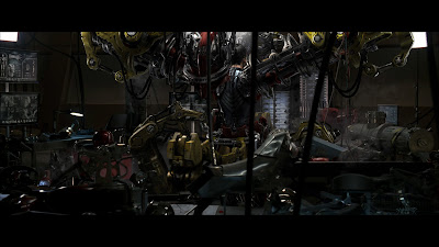
Some details of the leg and torso mechanicals...


This represents the final leg design. The original concept for the "suit-up" involved an expanding "sarcophagus" that would open up into a kid of mechanical wardrobe or steamer trunk. Tony would grab onto something like pull-up bars and lower himself into these expanded legs first, and they would seal over him. The scene was cut before shooting began, but thankfully reintroduced in post production, in the more dynamic fashion featured in the film. I'll post design sketches and storyboards from that sequence later...


The torso section would have been lowered over Stark's head, expanded like a watchband so that he could slide it on like a pull-over. The idea was to give the impression of micro-mechanical musculature, a low-profile layer of pistons and levers that acted like abs & serratus muscles with a thin shell of armor over top. The chest piece would clam-shell over as it does in the final scene. We ended up splitting this piece into front and back sections bolted together at the sides, which made for some cool detail shots. The folks at ILM really expanded on the details I'd suggested, referencing a lot of cool robotic and mechanical components for the suit-up. I can't believe what an amazing job they did.

Ironman Suit Design Images

Here are a few of the final design renderings for the Mk 3 suit.


The above is a nearly final iteration of the front 3/4 of the suit. The lower boots changed, as well as the upper chest & trapezius muscle area along with some cutline details, but that's essentially what we went with.


The back went through multiple proposals from both Adi and I. This was the final after some hip/butt area modifications mandated for flexibility by Stan Winston's team. I may post the rejected designs at a later date...

The final helmet design, streamlined by suggestions from Adi. The final helmet was sculpted by Miles Teves, who added the more direct cheekbone cutline as seen on the final suit. Miles's awesome sculpt was scanned and mirrored at Stan Winston studios, but his surfaces remain essentially intact in the final casting.

Ironman opens!!!


Yes, it's finally here! And it does truly rock. Ironman opens wide today, and I'm hoping everyone goes to see it, since it represents about a year and a half of my life.

I collaborated on the design of the Mk 3 suit with comic art genius Adi Granov, as well as designing Tony Stark's house, the Stark Jet & designing, storyboarding and directing the previs for the "suit-up" sequence. My own site is due for an overhaul (and it's really hard to update, thanks to my lame website programmer... uh, me,) so I'm going to start posting some design sketches up here on the old blog. Look out for them! Sadly there's no "Art of Ironman" book announced (sigh.) I guess they were hedging their bets in case the movie flopped.

Which I can tell you after seeing it, it most decidedly WILL NOT. You're all in for a treat.

CTV (a canadian television network) just posted an interview with me about my role in the design of the Ironman Mk3 suit. You can check it out here.