skip to main |
skip to sidebar
The suit design process involved a lot of ideation before settling down and refining the final Mk3 design. Below are some of the sketches from that exploration. This was kind of a shotgun approach, trying out a lot of different aesthetics and rendering techniques. This first one was an attempt to try to update the color breakup of the original red and gold suit. This one is a lot more of a bruiser than the final production model, and I was exploring some form ideas to try to give the impression of solidity to the sheet metal, shearing off organic forms to create flat surfaces defined by strong edges. This was an approach that we ended up adapting to the final design in areas like the forearms & legs.
 The next one came from the concept of "wearable ordinance" as an alternative to the more streamlined "wearable aircraft" approach that had emerged from Adi's original sketch. I referenced modern tank ablative armor, as well as medieval and roman armor. It had an interesting aesthetic, but ultimately wasn't iconic enough.
  This was an attempt at a more modular and organic approach, that would have used Electroactive Polymer Actuators (real-life artificial muscles that are being developed by JPL and NASA, using plastics that contract or expand when current is run through them.) Jon noted that the audience expectation would be more mechanical, with miniaturized pistons, actuators & servos to connect with the metaphor of Iron Man. I think he went in the right direction.
 A more streamlined and athletic approach that tried for thicker overlaps between plates. Jon felt that this was too much of a "swimmer's body", rather than the more powerful boxer's build he was looking for. As I think we all expected from the beginning, an evolution of Adi's wearable airplane design was ultimately the way to go. I also spent a lot of time in this phase working on a Mk 4 suit which would be a militarized version (can you say War Machine, anyone?) that was ultimately cut from the script. With any luck it will turn up in the sequel!
It seems to be a dark time for my childhood heroes. I only discovered in my latest Cinefex that one of my absolute favorite artists has also passed on. John Berkey was one of the greats, with an unmatched fluidity and effortless-looking style. I first discovered Berkey's work with the unforgettable poster for Star Wars, and the fold-up epic battle poster that came with the first album I ever bought with my own money, the Star Wars Soundtrack. I remember being outraged in the way only a nerdy kid can, at how there were multiple Millenium Falcons in the piece, and how the TIE Fighter's solar panels were square, rather than hexagonal.As I began to become an artist in my own right, Berkey's masterful ability to denote solid form in the fewest, seemingly effortless brushstrokes became a goal that to this day I despair of ever reaching. It was always a delight to discover his visions of space and technology hiding in the pages of Popular Science or Road and Track, and I would find myself picking up softcover SF books from authors I didn't even read, as the Berkey covers promised wonderous adventure that the text could rarely live up to. There was an optimism to his visions of titanic, streamlined spacecraft tracing rainbow contrails through the firmament that evoked a heady time of exploration and discovery that we seem to have lost in this period of cynicism and apathy toward space.A prolific artist, he left us a wealth of pieces to continue to inspire us, and in recent years two collections of his work were published, something I could only have dreamed of as a child. Hopefully his work can keep inspiring new generations for years to come.
By now everyone has heard about the passing of one of the greats, Stan Winston. Stan had been a hero of mine since the days of Terminator & Aliens, when as a kid I would pore over the pages of Cinefex and Starlog and dream of working alongside these masters of imagination. Well, by the time I got my chance, Stan had long since handed off the hands-on side of the business, but I did get to meet him & work closely with his talented crew on two movies, Zathura and Ironman. While I only had brief contact with him, he was always gracious and complementary of the design that my colleagues and I brought to the process. I have never had any work of mine treated with more respect or been more faithfully and masterfully executed as his team has done.
Stan has left our industry with a legacy of some of the most iconic, memorable and convincing creations to grace the silver screen, always stealing the show from their flesh and blood stars. My sympathies go out to his family and friends and the long-time colleagues he leaves behind.He will be missed.
Just came back from New York, where Adi Granov & I spoke on a Costume Design panel at the Superheroes: Fantasy & Fiction symposium at the Metropolitan Museum of Art. Joining us was Gordon Smith of FXSmith, who was responsible for Mystique and Nightcrawler's makeup effects in the X-Men movies. Great guy, and a pleasure to get to know. Quite an inspiration to see how that work came together.
Many thanks go out to Peter Coogan, Shannon Bell Price, Joseph Loh and our moderator Geoff Klock for making it such a pleasant experience for us. Adi took some photos of us in front of the exhibit, and I'll be posting them as soon as he gets back home from Wizard World in Chicago.
The Metropolitan Museum of Art has put up a page of quotes by the designers of the costumes featured in their Superheroes: Fiction and Fantasy exhibit. Adi & I have our quotes HERE. Remarkable how we both seem to have come up with much the same thing to say about it, given we didn't talk about it beforehand. Just another example of what a great meeting of the minds this project was, if the final design wasn't evidence enough.Below is a picture of the Mk2 suit in the exhibit, from the Met website.
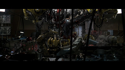 Here's a concept painting I did in post-production for the suit-up sequence. This was a scene I really thought was important to selling the believability of the suit. An earlier and much more low-tech version (see Rodolfo Damaggio's excellent storyboards HERE) got cut for budgetary reasons early in the script, but thankfully the idea got revived for reshoots. The sequence is remarkably all-CGI, since it was accomplished long after the sets had been struck. For this illo I painted over (or into, rather) a plate from a dolly shot within the garage set. The idea would have been to composite the new CGI into the shot, replacing the existing live action. It ended up (as you can see) being a really crowded space, so they rightfully placed it in a broader expanse of the garage, rebuilding the set digitally from set photos. I worked with Kent Seki and his crew at PLF to storyboard and direct a pre-vis of the sequence, which was approved and sent to ILM. I was unbelievably impressed with their execution, it's remarkably realistic, and they did an incredible job expanding on the details I only suggested in this illo and a handful of storyboards. Kudos to PLF and the crew at ILM for one of the most convincing sequences I've seen in awhile.
Adi Granov and I have been invited to participate in a conference at the Metropolitan Museum of Art in New York City on June 22nd, as part of a special exhibit put on by the Costume Institute, "Superheroes: Fantasy & Fiction." The exhibition is sponsored by Giorgio Armani and features movie costumes and the haute couture that they have inspired. Our Mk3 suit is exhibited under the category of "the Armored Body," along with some outrageous Thierry Mugler chestplates & other biomechanical fashions. So if you happen to be in NYC, I'd love to see you there. I believe the conference is free to the public. You can find a link HERE.
Oh, and here are the suit elevations, I thought I had posted them here, but I guess it was just up on conceptart.org.


